Data Visualization: Design Principles and Processes
SMM635 - Week 1
What is Good Data Visualization?
The fundamental question every data analyst must ask
“Excellence in statistical graphs consists of complex ideas communicated with clarity, precision, and efficiency.” - Edward Tufte
Tale of Two Visualizations
Example A: Technical Plot 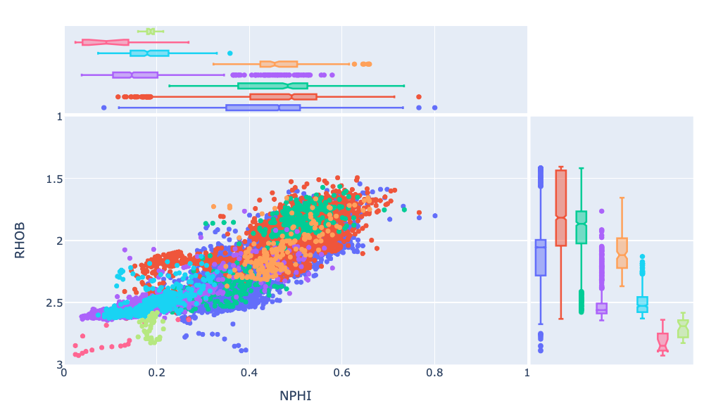
✓ Shows data relationships
⚠️ Cluttered interface
⚠️ Distracting elements
Example B: The Economist 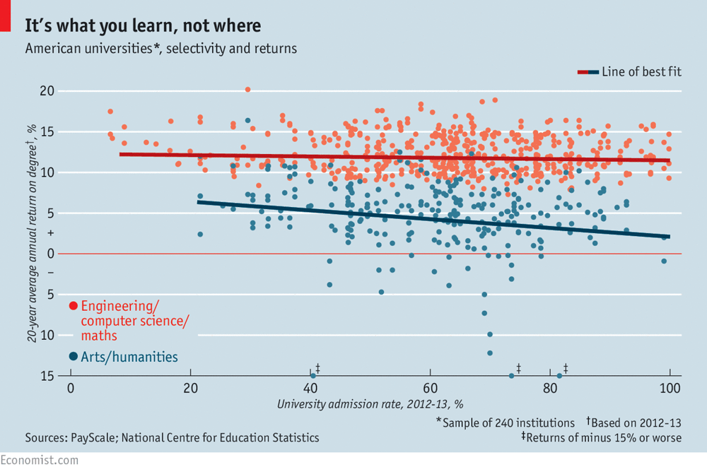
✓ Clean, focused design
✓ Clear narrative
✓ Professional aesthetics
Tufte’s Principles of Graphical Excellence
Excellent visualizations should:
- Show the data clearly and accurately
- Induce thinking about substance, not methodology
- Avoid distortion of what the data reveal
- Present many numbers in a small space
- Make large datasets coherent
- Encourage comparison between data elements
- Reveal data at multiple levels of detail
- Serve a clear purpose: description, exploration, or decoration
- Integrate with statistical and verbal descriptions

The Power of “Show the Data” - Anscombe’s Quartet
Four datasets with identical summary statistics
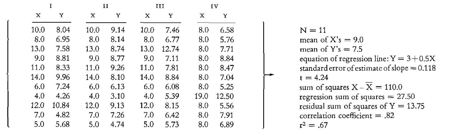
Same means, same correlations, same regression lines…
Anscombe’s Quartet Revealed
…but completely different data patterns!
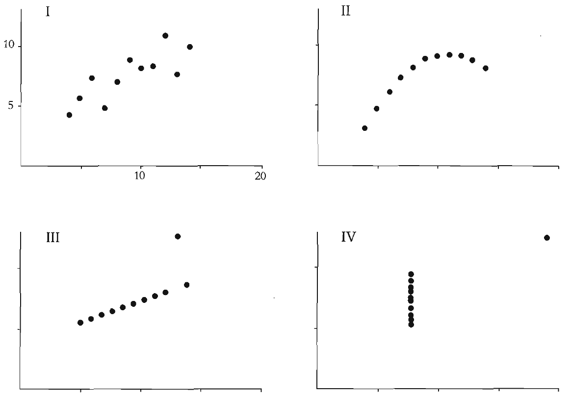
Important
Key Lesson: Summary statistics alone are insufficient. Always visualize your data to understand its true nature.
The Design Process Framework
Source: Cairo, A. (2012). The Functional Art
Design Principles in Action
Traditional Approach 
Heavy gridlines, excessive decoration
Tufte’s Approach 
Minimalist, data-focused design
Principle: Maximize the data-ink ratio - every mark should represent data
Chart Junk - What Not to Do
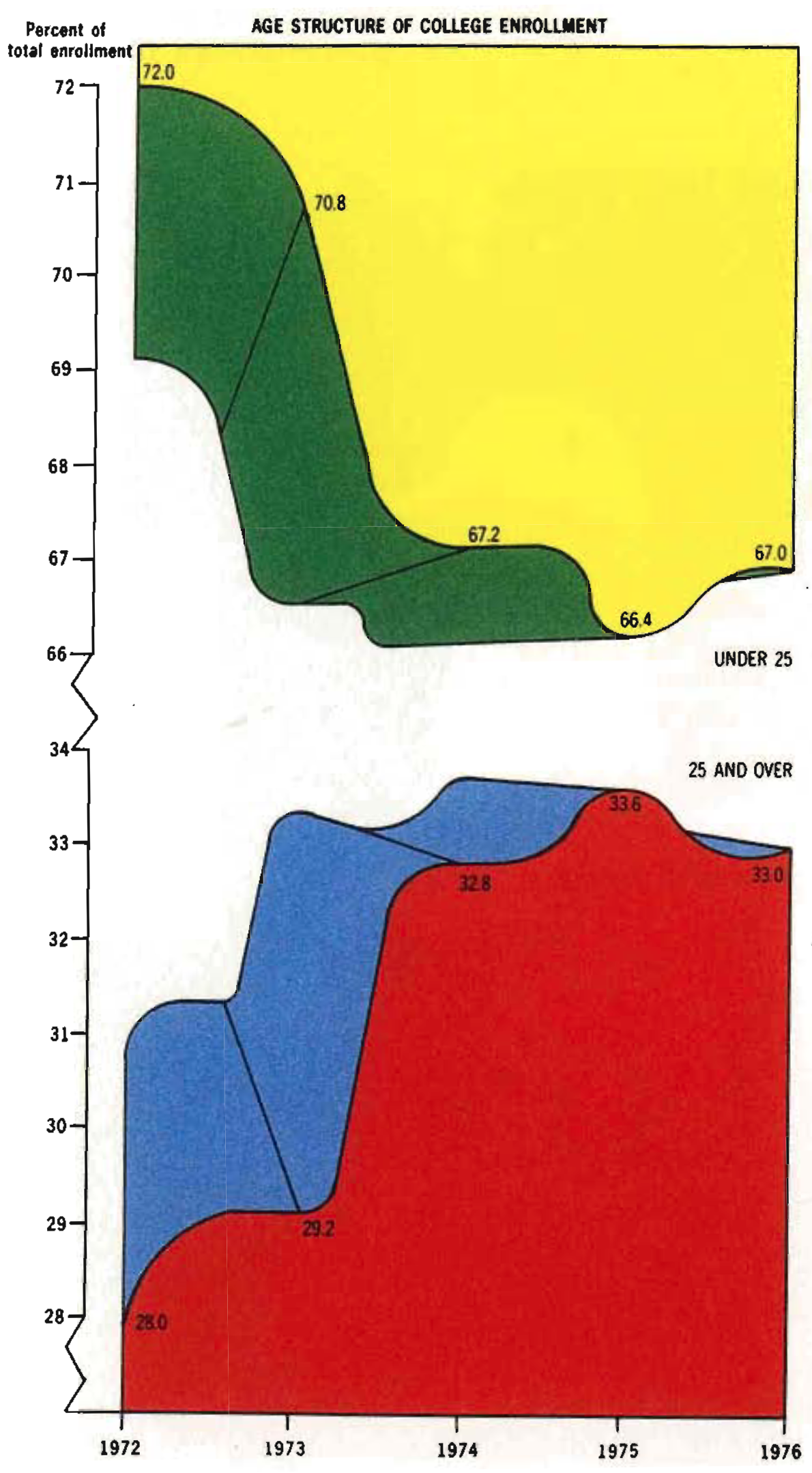
Warning
Chart Junk: Visual elements that distract from the data
- Unnecessary 3D effects
- Decorative images
- Excessive colors
- Heavy borders and gridlines
- Moiré patterns and visual noise
Before and After - Redesign Example
Before: Cluttered Design 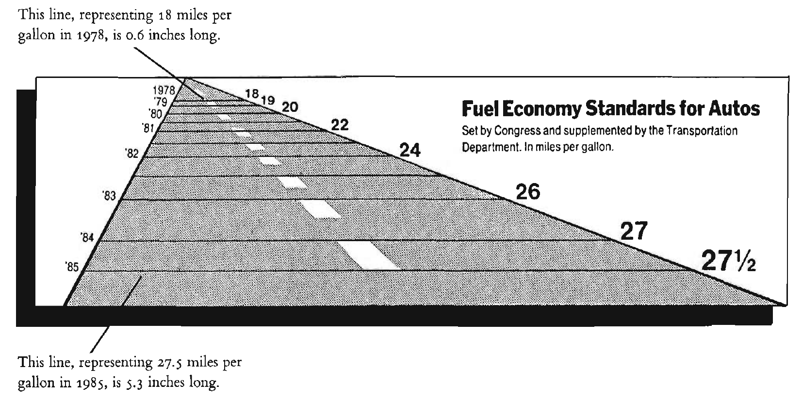
Issues: 3D effects, poor labeling, distracting elements
After: Clean Redesign 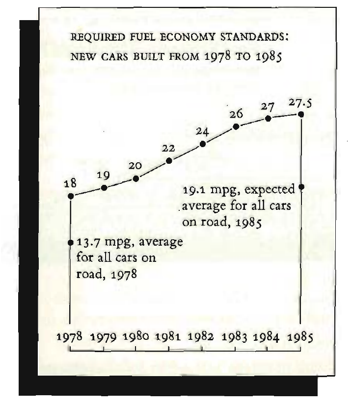
Solutions: Clear hierarchy, direct labeling, focused design